Happ & Fleur
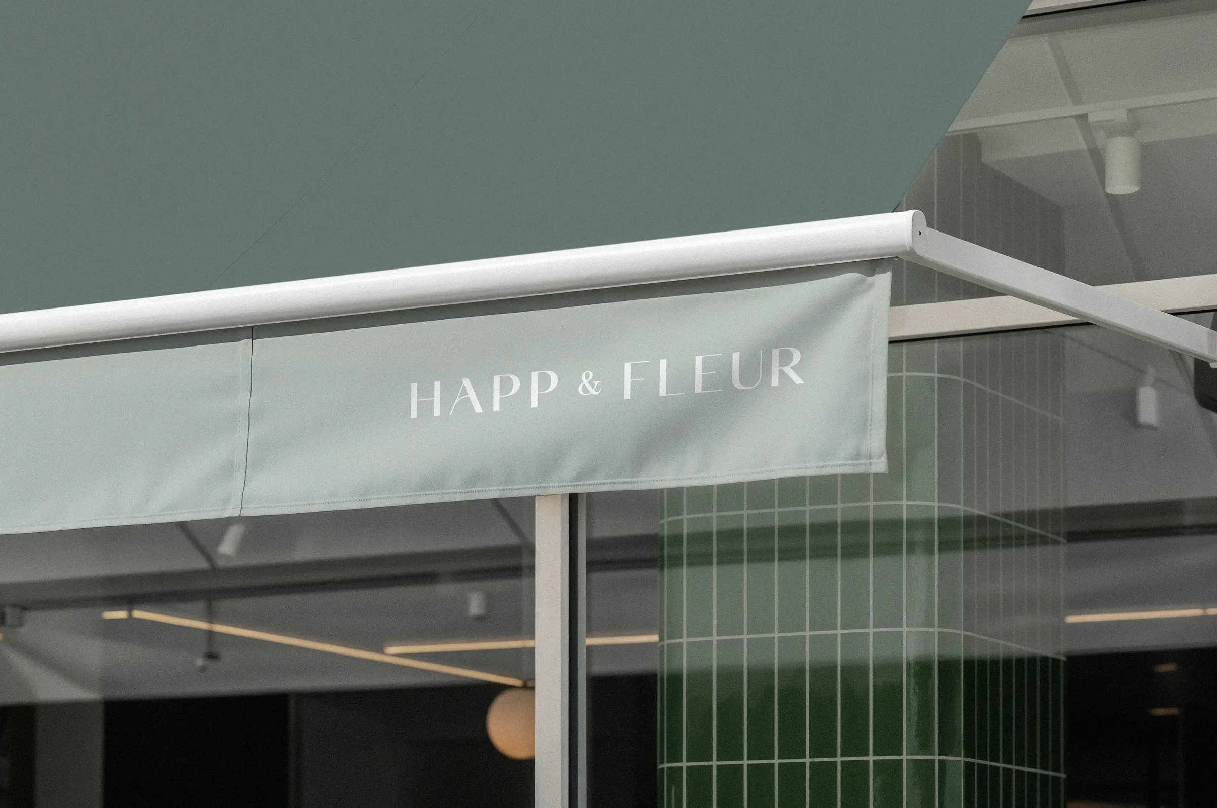
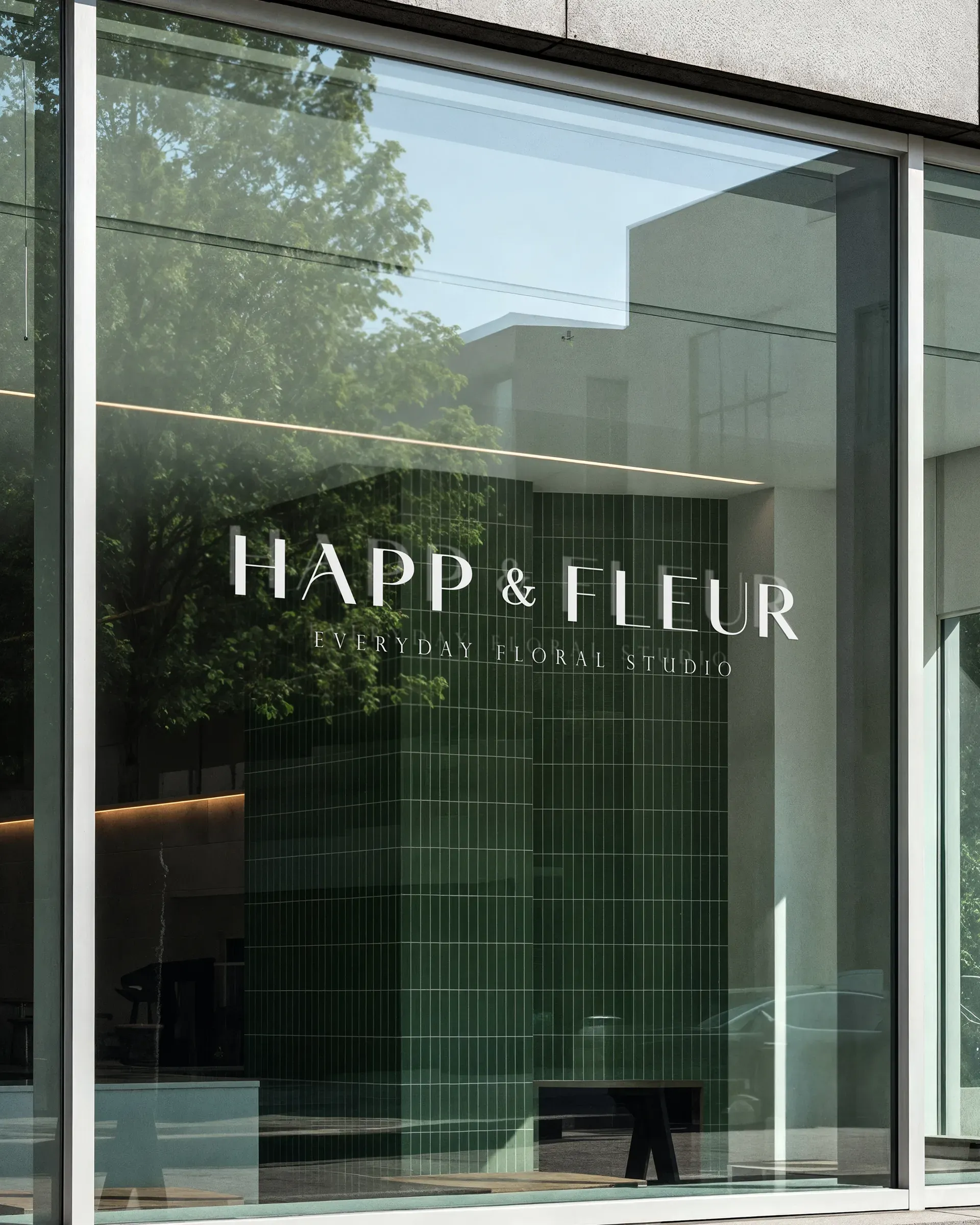
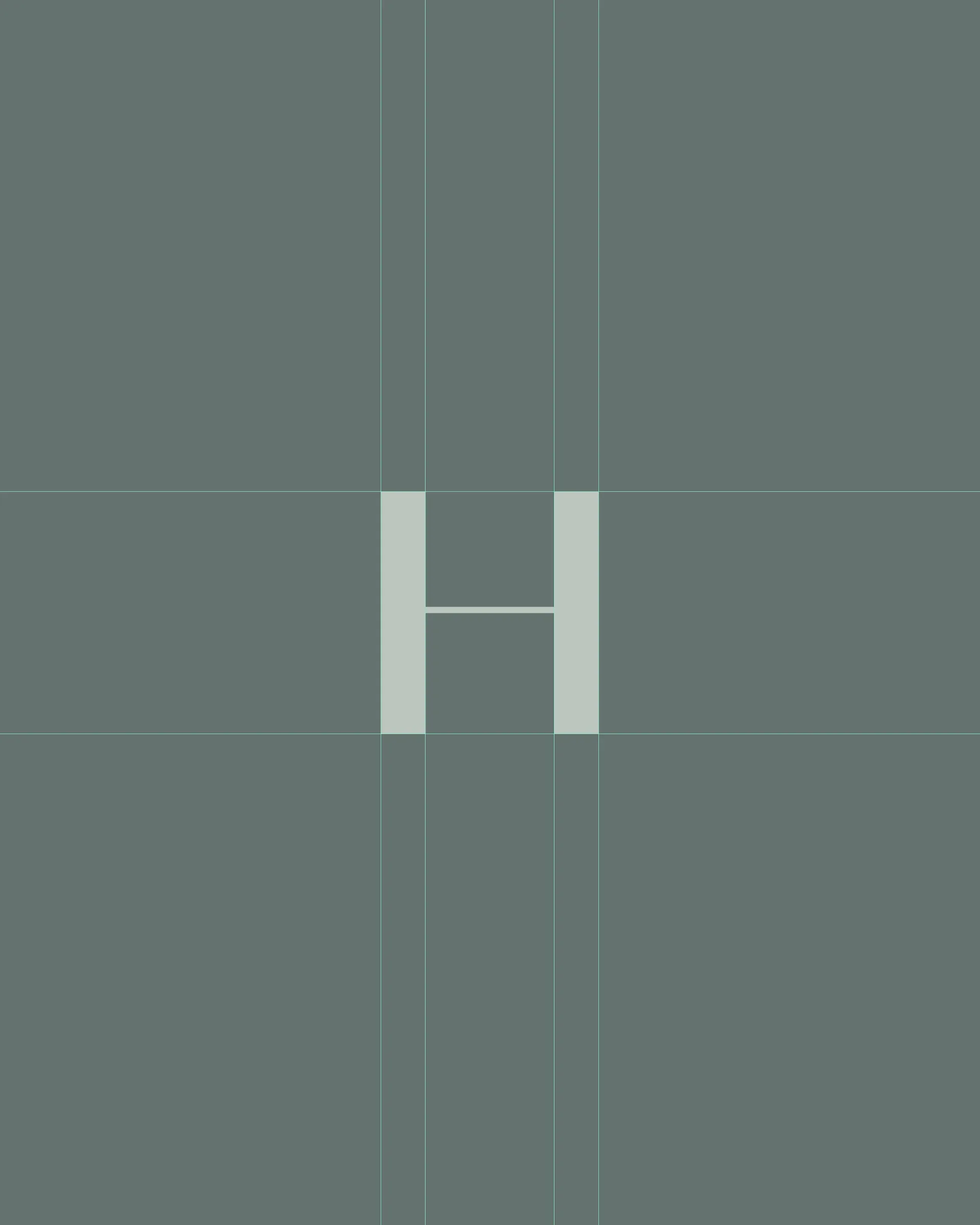
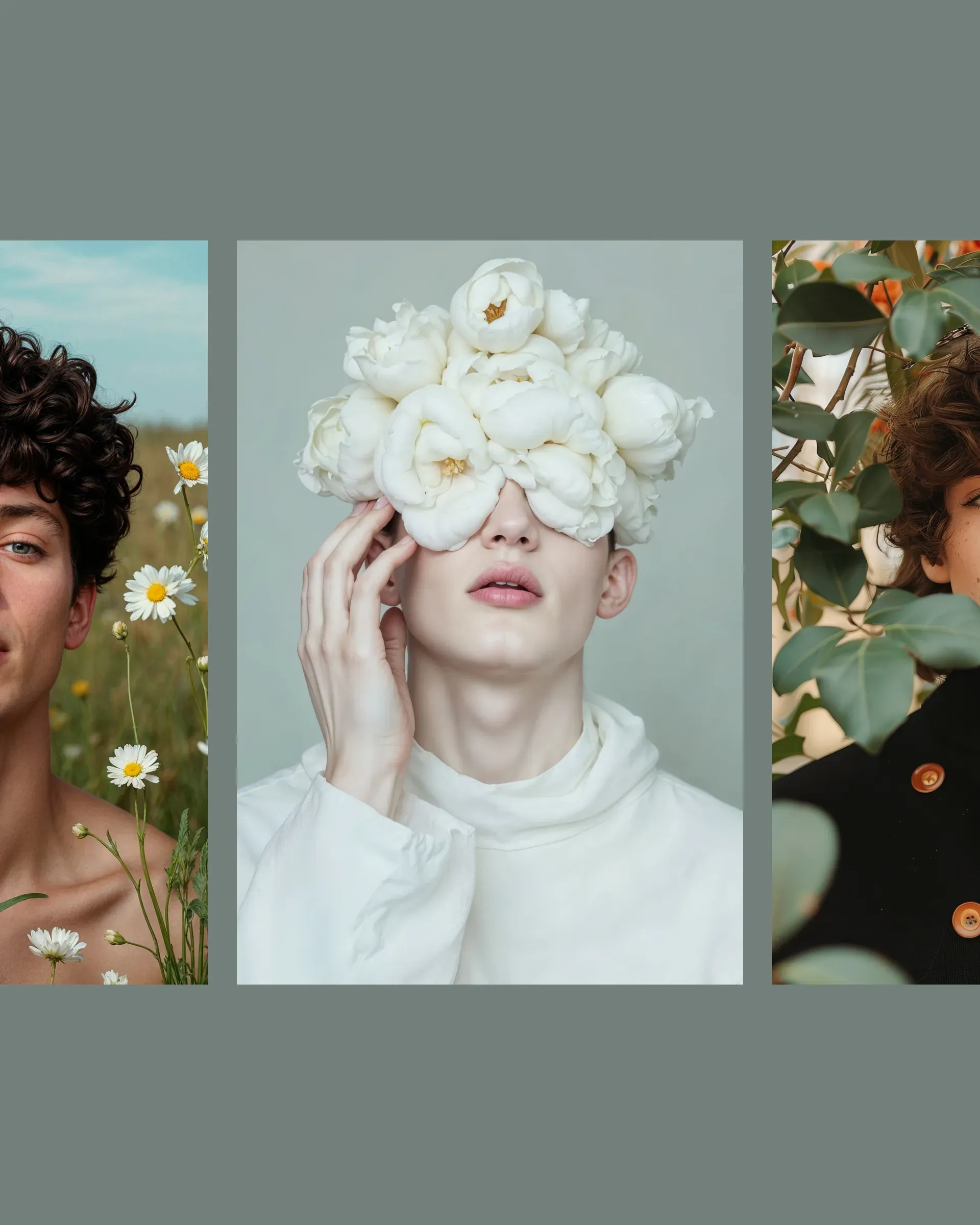
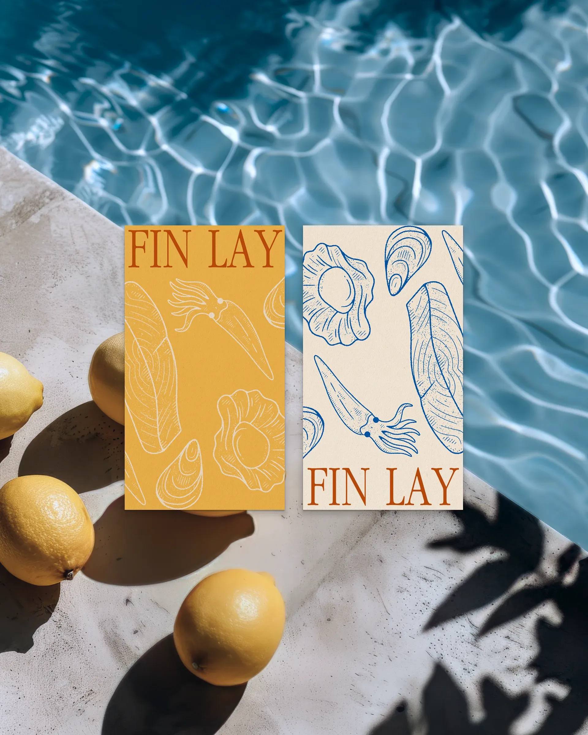
Happ & Fleur is built on a balance between structure and softness. The identity combines clean geometry with organic elements, creating a visual language that feels both composed and alive.
Minimal layouts provide clarity, while natural forms introduce warmth and subtle variation. This contrast allows the brand to remain refined while still feeling expressive and approachable.
- Services: Full Branding Design
- Logo Design
- Packaging Design
- Marketing Materials
- Pattern & Visual Assets